Atwater Light!
“Refreshing!”
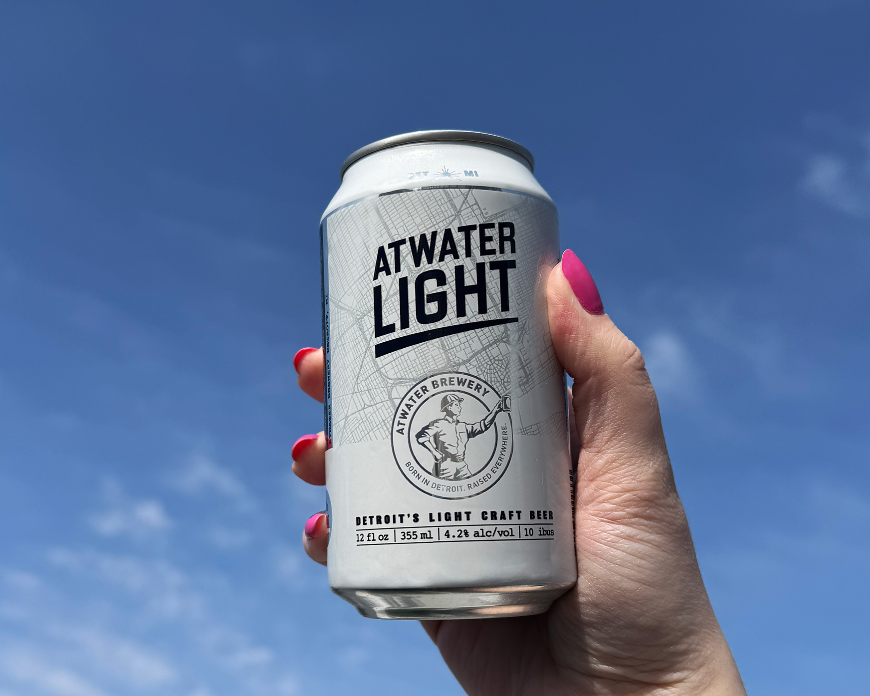
channel: can + packaging design
keywords: branding, dielines, packaging, social media content, point of sale design
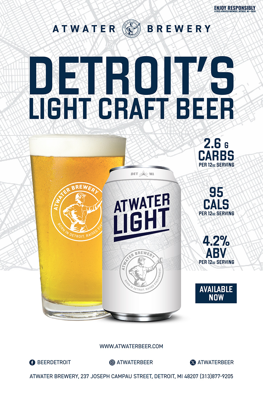
Atwater’s newest light beer was in need of a quick turnaround. The goal was to make this “Detroit’s Light Craft Beer” and by utilizing a map of Detroit city streets to leverage that idea, the design is supposed to really hammer home the pride of the city which Atwater was born. I also wanted to make a simple and clean design that would not only convey the lightness of the beer, but create something that looks nice in hand.
Development
Due to the rushed nature of this project, Atwater Light was created in a matter of hours. Within a day, the name was chosen and a design was brought to life.

POS Design
Along with the design of the can and carrier, point of sale was very specific to Detroit and marketing it as a light craft beer meant call-outs to the carb, calorie and ABV were crucial. Whether at a baseball game or at the lake, Atwater Light is sure to refresh.